
Bajorat Media
Optimize contact forms: get more qualified inquiries
How businesses plan contact forms so visitors can inquire more easily and teams receive better project context.

Contact form optimization does not mean removing as many fields as possible. What matters is whether visitors can take the next step without uncertainty and whether your team receives enough context for a useful reply. For businesses, the form is not a technical appendix to the website. It is an important point between interest, trust and sales.
For services that need explanation, a form with name, email and message is often not enough. It creates inquiries, but not automatically useful conversations. On the other hand, a project form that feels too long can deter people who would actually be a good fit. The better solution is a clear contact logic: short paths for simple questions, focused additional questions for project inquiries and measurable quality instead of submission counts alone.
Contact form optimization: what should actually improve
Before changing fields, buttons or error messages, the purpose of the form has to be clear. A general contact form has a different job than a project inquiry, callback request, support form, recruiting application or download lead.
Typical goals include:
- lower the barrier so visitors make contact
- improve inquiry quality so follow-up questions take less time
- make assignment easier for the team, for example by topic, location or budget range
- reduce spam and unsuitable inquiries
- identify form drop-offs and technical errors
- evaluate marketing and sales data more effectively
These goals can conflict. More required fields often provide more context, but may reduce submissions. A fully open form lowers the barrier, but often produces vague messages. That is why optimization should not start with the question of whether one field is “too much”. It should start with this question: which information is truly needed at this point?
Separate general contact from project inquiries
Many business websites push every request into a single form. That looks simple, but moves complexity into the handling process. A question about an existing project, a partnership message, a support case and a new website inquiry need different information.
For B2B websites, splitting the paths is often useful:
| Contact path | Purpose | Useful fields |
|---|---|---|
| General contact | short question, callback, existing contact | name, company, email, phone, message |
| Project inquiry | new website, relaunch, marketing, automation | topic, goal, timeline, budget range, existing URL, optional upload |
| Special form | clear use case such as check, audit or application | a few use-case-specific fields instead of generic free text |
This separation fits the wider website concept. The guide on website planning explains why contact paths should be planned early instead of being attached to finished pages at the end. Businesses that want more qualified inquiries and leads should start here: not every visitor needs the same path.
Choose fields based on the decision situation
A good form does not ask everything the team would find interesting. It asks what is needed for the next step and what visitors can understand.
Useful required fields are usually:
- first name and last name when personal communication matters
- company, association or organization when B2B context matters
- email address for the reply
- phone number when a callback is actually offered
- topic or request type so the inquiry can be assigned
- message or short project description
Additional fields need a visible purpose. A budget field can be useful if it helps determine project scope, consulting depth or the right offer path. It feels wrong if visitors can barely estimate a realistic range. A timeline field helps with prioritization, but should not force every contact into choosing “immediately”.
For project inquiries, a staged model often works well: a few required fields plus optional details about goal, budget, timeline and file upload. Committed visitors can provide more context, while early-stage prospects do not have to drop out.
Labels, help text and error messages decide usability
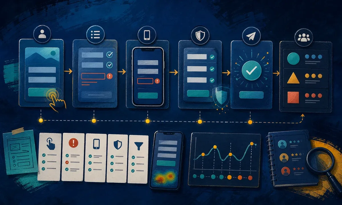
Forms rarely fail because of length alone. Fields are often unclear, error messages appear too late or visitors lose entered data after a mistake. That creates friction, especially on smartphones.
The Web Content Accessibility Guidelines (WCAG) are a useful foundation here. W3C explains under Labels or Instructions that users need to understand what information is expected. Under Error Identification, identified input errors should be named and described in text. This is not only relevant for accessibility. It improves form quality for everyone.
In practice, this means:
- Every field has a visible label, not only a placeholder.
- Required fields are recognizable before submission.
- Error messages appear directly next to the affected field.
- The message says what is wrong and how to correct it.
- Data that has already been entered remains available after an error.
- Keyboard operation, focus states and mobile keyboards work.
- Autocomplete attributes help with standard data such as name, email or phone.
MDN describes the HTML autocomplete attribute as a hint to the browser about which type of information is expected in a field. On mobile devices, this can noticeably reduce friction when the right keyboard and saved data are offered.
Build trust before submission
A form is easier to complete when the next step is clear. Visitors want to know what happens with their data, when they can expect a response and whether they should enter sensitive information.
Useful notes should be close to the form instead of hidden in small print:
- “We usually reply within one to two business days”
- “Do not send login credentials through this form”
- “Only upload files if they help with the first assessment”
- “Your information will be used to process the inquiry”
- “For general questions, a short message is enough”
These statements have to match the real process. Otherwise the contact form promises more than the team can deliver. Especially for web design and concept, online marketing or automation and AI, trust grows when visitors understand how their inquiry becomes a conversation or first assessment.
Lead qualification without deterring good prospects
Lead qualification is often mistaken for adding more form fields. A better approach combines field logic, context and team evaluation.
A website can distinguish, for example:
- topic: website, relaunch, SEO, campaign, maintenance, automation, accessibility
- project phase: first orientation, concrete need, ongoing project, urgent issue
- urgency: short-term, within the next few months, long-term plan
- frame: budget known, budget open, budget needs to be estimated together
- existing basis: current website, new domain, shop, portal, campaign
Not every field has to be required. Some details work well as selections, others as free text. For more complex projects, a multi-step form can help as long as it does not feel like an interrogation. The important point is that the selection makes consulting easier and does not merely ask for team categories.
For teams with high inquiry volume, a structured evaluation is also useful: Which inquiries are answered immediately? Which ones need follow-up questions? Which ones are not a fit? Which campaigns or pages create the best conversations? This evaluation leads to better optimization than submission numbers alone.
Put form tracking in context
Measurement helps when it does not stop at submission. Google Analytics 4 can use enhanced measurement to capture form_start and form_submit. Google describes these form interaction events as events that can compare started forms and submitted forms.
For practical work, that is not always enough. A form can be submitted technically but still be unusable for the team. Or it can have many starts because one field attracts curiosity, but generate very few qualified rejections or project conversations.
Useful measurement points include:
- form visible in the viewport
- first interaction with the form
- validation errors per form step
- successful submission
- thank-you page or success state
- topic or inquiry type, where privacy-compliant evaluation is possible
- evaluation in the CRM or manual inquiry review
For campaigns, this layer is especially important. The article Google Ads landing page optimization explains why form, landing page and tracking need to be reviewed together. A cheap lead is worth little if it does not fit the offer.
Review technical quality and data protection
A contact form is also a technical process. Mail delivery, spam protection, uploads, validation, consent, server logs, tracking and redirects have to work together.
Before publication or after larger changes, check:
- The form sends reliably to the right address or interface.
- Required fields are validated on both client and server.
- Spam protection blocks bots without excluding real users.
- Uploads are limited and only available when needed.
- Success and error states are clear.
- Privacy text matches the actual data flow.
- Tracking only fires in the intended consent context.
- Test inquiries are marked as tests and not evaluated as real leads.
This review is not only relevant during a relaunch. New landing pages, changed form providers, plugin updates, new CRM connections or consent changes can alter the process. When the website creates central business inquiries, the form should be tested regularly.
Conclusion: a good form is part of user guidance
Businesses that work on contact form optimization should not only count fields. The better view is the full inquiry situation: What does the visitor already know? Which information does the team need for the next step? Where does uncertainty arise? Which technical or usability errors occur? And which inquiries are economically relevant?
The best form feels short to visitors while still providing enough context. It explains fields, keeps entered data, works on mobile, is accessible, protects against spam and can be measured. Then the form becomes more than a contact path. It becomes a reliable part of website, marketing and sales.