
Bajorat Media
Website Design System: How Businesses Keep Pages Consistent
How a website design system brings together reusable components, content patterns, and technical rules for consistent, maintainable business websites.

A website design system brings recurring decisions into one place: which buttons exist, how forms behave when validation fails, when to use a card, and which heading structure belongs in a section. That reduces coordination work. It also gives visitors familiar interaction patterns while editorial and development teams build new pages from the same foundation.
Business websites rarely grow in one release. Service pages, a careers section, downloads, or campaign landing pages are added over time. Without shared rules, similar but slightly different variants begin to appear. At first, the differences seem minor. Then a button uses three labels, forms show different error messages, and mobile cards no longer follow the same logic.
What a website design system does
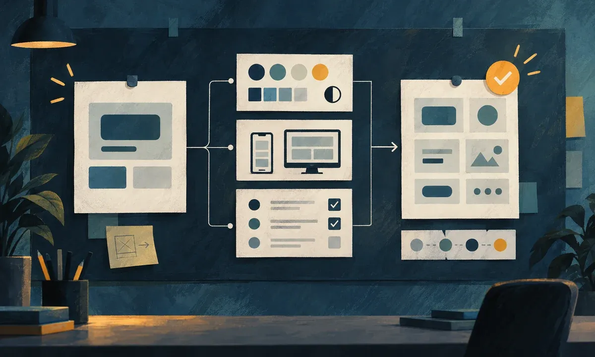
A website design system is more than a collection of colors and logos. It connects visual rules, reusable components, behavior guidelines, and examples of how to use them. Its size should fit the project. For a focused business website, a practical set of core components and clearly documented rules is often enough.
| Building block | Typical content | Practical benefit |
|---|---|---|
| Foundations | Colors, type sizes, spacing, image formats | Pages feel like one coherent offer. |
| Components | Navigation, buttons, cards, forms, accordions | Repeated elements do not have to be reinvented for every page. |
| States | Hover, focus, error, disabled, mobile | Interactions remain understandable outside the ideal case. |
| Content patterns | Hero, service section, FAQ, case study | Editorial and design work with appropriate page structures. |
| Rules | Use, variants, ownership, approval | New requirements enter the system in a controlled way. |
A style guide often describes appearance. A component library provides building blocks in a design or code tool. A design system combines both and adds the question of how those parts work in real user journeys. It does not have to become a large portal. What matters is that people writing content, designing pages, and implementing functionality refer to the same source of truth.
The web design and conception service starts before implementation: audiences, content, navigation, and page types determine which components a website actually needs. A design system then documents those decisions so they are not lost when the site expands.
Why consistency is not only a visual design issue
Visitors should be able to recognize repeated functions. The W3C explanation for WCAG 2.2 Success Criterion 3.2.4 describes consistent identification of components with the same function as support for recognition and predictable use. The same principle applies to navigation: repeated navigation mechanisms should appear in the same relative order, as W3C explains for WCAG 3.2.3.
This is not limited to the primary navigation. A contact link, search field, download, or appointment booking should behave consistently when it appears in comparable places. For people navigating with a keyboard or screen reader, visible labels, accessible names, and focus states belong to the same expectation as color and spacing.
A design system does not replace an accessibility review. It does help prevent a solved requirement from being lost on the next page. When a form field with label, help text, error message, and focus state has been implemented robustly once, the pattern can be reused with confidence.
Start with a component inventory
The most productive start is rarely a complete rebrand. First, examine elements that already appear several times across the website. Screenshots of desktop and mobile views make variants easier to spot. Does the primary button follow the same label logic everywhere? Are there four card variants with nearly the same purpose? Do landing pages structure headings differently from service pages?
For an inventory, these seven groups are usually enough:
- Header, navigation, breadcrumbs, and footer.
- Buttons, text links, and other calls to action.
- Headings, introductions, lists, quotations, and tables.
- Cards for services, references, articles, and downloads.
- Forms, including required-field indicators, errors, and success states.
- Interactive patterns such as accordions, tabs, filters, or cookie settings.
- Images, captions, alternative text, and responsive image ratios.
Assign every variant to one of three questions: does it serve its own purpose, is it only a visual variation, or is it a defect that should be standardized? This turns a long list into a prioritized work inventory. A website content audit adds the editorial view: pages with overlapping messages or outdated modules become visible alongside duplicate design patterns.
Components need usage rules
A component is only easy to hand over when its boundaries are documented. A button set without rules quickly creates new exceptions. Describe not just the default appearance, but also purpose, content, and behavior.
What belongs on a robust component page
- Purpose: what the element is for, and what it is not for.
- Variants: for example, primary, secondary, and a restrained text link rather than an unfocused range of choices.
- Content: appropriate lengths for labels, headings, and teasers, plus rules for icons and images.
- States: hover, keyboard focus, error, loading, disabled, and narrow-screen views.
- Semantics: the correct HTML element, label, and relevant ARIA information.
- Examples: one realistic use on a page rather than an isolated tile.
Cards benefit from a clear separation by task. A reference card may carry different information from a service or article card. They do not necessarily need to look identical. The differences should be based on their purpose and remain repeatable. That prevents every new landing page from introducing its own mini design language.
A focused maintenance process keeps the system useful
A design system becomes difficult to use when every small request either turns into an exception or requires an extended approval path. For many SMEs, a short workflow with clear ownership is enough:
- Record the need: which user journey or content requires an additional function?
- Review existing elements: can the task be solved with a current component?
- Sketch the variant: describe content, desktop and mobile views, states, and potential barriers.
- Test it in a real page context: does the element work with the copy, image, screen width, and keyboard use?
- Decide and document: add it as a new variant or reject the exception.
This keeps the library small enough to be used. A practical rule is that new variants should cover a recurring need. A one-time campaign may still have its own accent, but it should not change primary navigation, form logic, or core calls to action without a strong reason.
Small-screen testing belongs in this process. The responsive web design service looks beyond column widths. Order, line length, touch targets, image crops, and button-label length all affect whether a pattern remains usable on the move.
Common pitfalls when building a system
A design system can try to regulate too much too early. Teams often create a large library before they understand their relevant page types. Someone then maintains dozens of abstract tokens while a real contact form still has no error-handling pattern.
It is equally risky to keep the system only in a design tool. By the time content and development teams work with it, spacing, image formats, heading rules, and states need to exist in a form that can be implemented and tested. The design and code libraries do not have to use the same interface, but they should use the same terms and variants.
Avoid these three shortcuts:
- Treating colors alone as a design system when components and states are missing.
- Copying a button visually without considering its destination, focus state, and mobile label length.
- Keeping every exception indefinitely instead of reviewing it after a campaign.
Conclusion: Reuse makes room for the decisions that matter
A website design system does not remove every design decision from a team. It lets people spend time where it matters: user guidance, understandable content, and new requirements. Starting with an inventory of the current website, prioritizing repeated components, and agreeing on a maintenance process makes it possible to improve the site incrementally and consistently.
That is particularly useful for larger relaunches or grown websites. Many individual pages become a dependable foundation for new services, campaigns, and content, without renegotiating interaction patterns and brand presentation every time the site expands.